Magazine Mini Task
TASK / ANALYSE
CONVENTIONS + REPRESENTATION
BIG SEAN / XXL

XXL is an american hip-hop magazine.
Photographed Big Sean, Rapper.
Mid-Close Up.
Direct Address
He's in front of the Masthead and the text of all the other people who are in the issue, all of which are other rappers.
Masthead, font is big bold and short with a red background. This could either be a creative choice or they wanted to show that the significance of the magazine is the celebrity.
All American. So many stars in this magazine, unconventional feature of the coverlines in the background rather than in the foreground which anchors the meaning of it being of american and hip-hop.
Ethnically diverse, the background text may not show pictures of the other rappers but there are different rappers from different races.
E.G. Mac Miller is of a white ethnicity but then we have other black rappers such as Kendrick Lamar
Cover star with the main cover line 'living the good life' refers to Big Sean living a rich and luxurious life.This is seen in the necklace Big Sean is holding against is head. The lion represents royalty.
The coverline text is the same font as the masthead but sans the red background
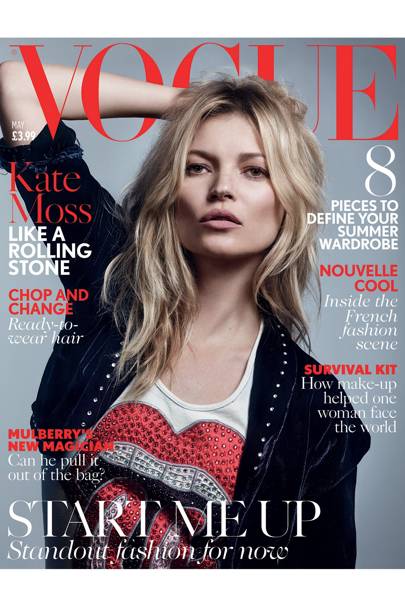
 KATE MOSS / VOGUE
 - Her arm is going through the O, to show that Kate Moss is one of the most known models and Vogue being one of the iconic fashion magazines.
- 3 Colour scheme, highly conventional of a magazine.
- (White Black & Red)
- The editor decides the colour scheme dependent on the photograph.
- Clothing has more of a grunge vibe to it.
- Going against the male gaze
- Looks attractive but not in an objectifying way.
- All fonts in serif, connotes sophistication and high-class.
- Use of a different sans serif font in the puff to make it stand out.
- Direct Address.
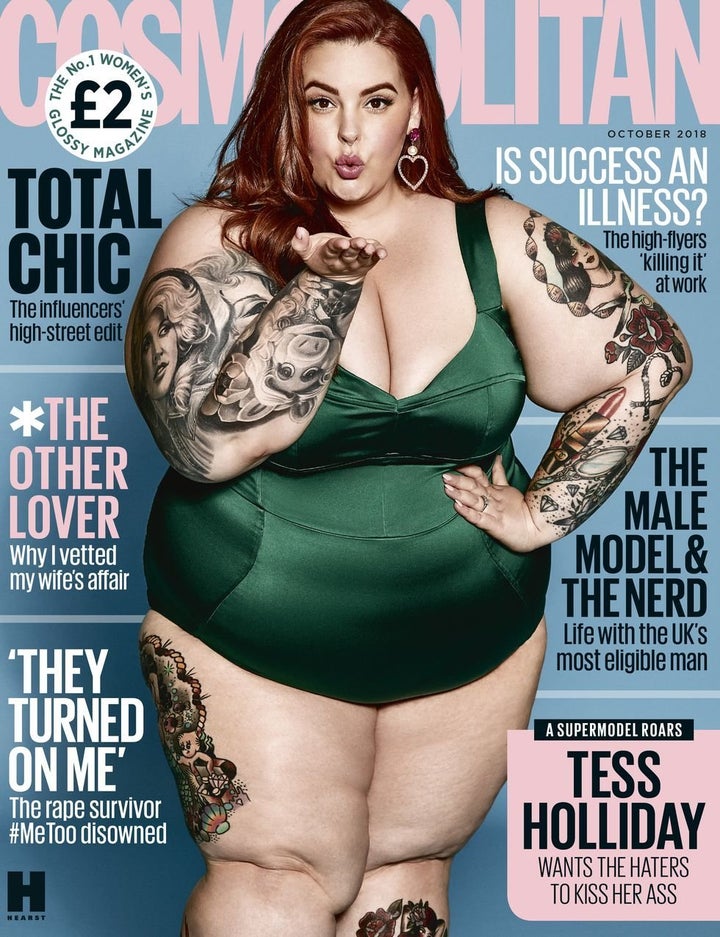
TESS HOLLIDAY / COSMOPOLITAN
 Plus size model, going against the whole idea of having someone skinny on the cover.
Well known american model, is tattoo'd as well.
Controversy in the media is saying that this promotes an unhealthy lifestyle, encourages girls to overeat and become obese.
Well if it's unhealthy to be overweight it's just as bad to be underweight.
Masthead is behind her which reinforces her dominance.
Direct Address, blowing a kiss, taunting.
Mid-Long shot, to deliberately show her body
Cover Lines are by the side, at the bottom which is unconventional.
Lots of cover lines, very crowded, maybe slightly disorganised but people will be getting a lot of value for money.
Comments
Post a Comment